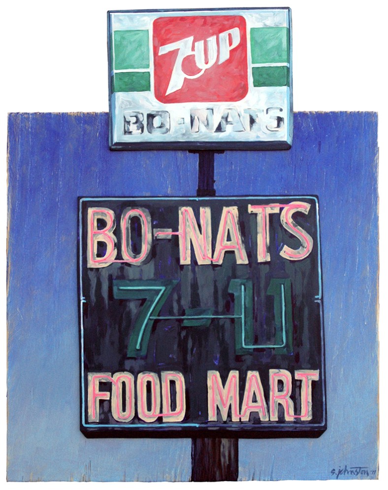
This painting is a larger version of one of the signs featured in “4 Signs” (below). “Bo Nats” intrigues me as a subject for almost the opposite reasons from “Dixie Drive Thru”. Whereas “Dixie” is a well-designed sign, “Bo Nats” is almost aggressively non-designed. “Dixie” is Elvis to “Bo Nats” Sex Pistols. Which makes it an interesting bit of popular communication.
Unlike Dixie, this version of the Bo Nats sign was removed a while ago. However, the little Bo Nats convenience store is still in business on Poinsett just above Cherrydale. As this version of the sign indicates, it’s still a no-nonsense, straight-up shop peddling “cigarettes, beer, bait” (as its current sign says). People who grew up in the neighborhood have told me that, when they were kids, Bo Nats was a place to bike over to and pick up a candy bar and a Coke. Nothing fancy. Just function.
The Dixie sign is a nicely organized collection of complimentary shapes. This Bo Nats sign is primarily a couple of squares, stacked one atop the other. In fact, this arrangement reveals some history. The larger bottom square is apparently the original sign. It’s pure function with a bit of advertising trickery. If I were to guess at this sign’s birth date, I’d put it somewhere in the 1970’s. This is when the Seven-Eleven chain of convenience stores spread nationwide. This sign reads: Bo Nats 7-11 Food Store. Were the proprietors (I’m assuming there’s a partnership here between a couple fellas called Bo and Nat) attempting a sideways association with the more popularly recognized national chain? No doubt. As such, this sign with its faltering neon tracery, is more than just an identifier on the highway. It’s employing some primitive marketing.
This marketing continues with the addition of the lighted sign on top. Here, the 7-Up company probably offered the store a deal for a free sign if they’d promote their soft drink. The lighted sign is a generic, mass-produced product on which the store’s name is hand-painted in black enamel. This was probably erected in the 1980’s. Weathering has worn at the enamel lettering, showing the original brushstrokes.
In composing the painting, I kept it as simple as the sign. It’s basically an arrangement of three squares. I’ve indicated sky and sign poles on the square piece of background plywood. This is “aged” at the edges and across the surface with rough sandpaper. I glued cutouts of the two parts of the sign over the plywood background. These are slightly off-center and tilted to show the subject matter’s casual approach to design and the decrepit condition of the sign.
The effect of the painting, for me, is very different from “Dixie Drive Thru”. “Dixie” is bright, cheery, and optimistic. “Bo Nats” by comparison, is more pensive but doggedly determined.
This painting is entered in Artisphere’s 2011 Artists of the Upstate Juried Exhibition.
